Hudson Associates Wealth
A private wealth management firm with a long client history and no website that reflected it. The project brought the firm's story, team, process, and client experience into one cohesive digital presence.
- Client
- Hudson Associates Wealth
- Industry
- Financial Services
- Location
- Tulsa, Oklahoma
- Year
- 2025
- Scope
- Website Strategy
- Custom Web Design
- Development
- Content Organization
- Responsive Design
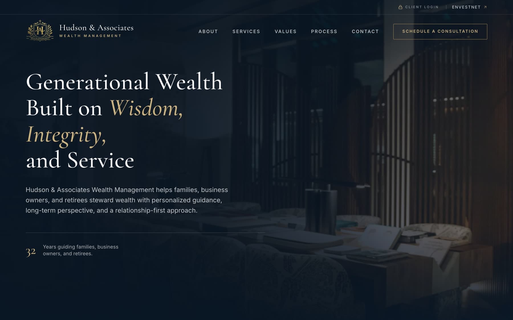
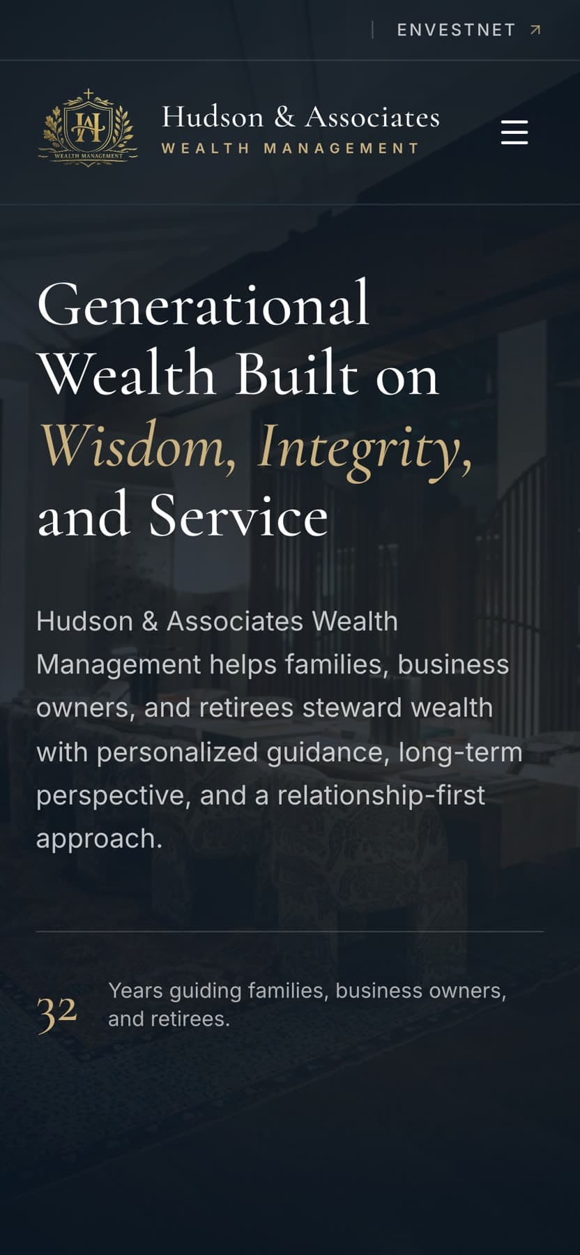
Homepage, desktop and mobile
Overview
What the project needed to do.
Hudson Associates Wealth needed a website that felt personal, established, and clear while presenting the firm's services and philosophy in a polished, modern format. The project brought the firm's story, team, process, and client experience into one cohesive digital presence.
The firm's work is relationship-driven and largely referral-based. Prospective clients arrive already warm, usually having heard a name from someone they trust, and the website's job is to confirm the impression rather than create it from nothing.
The problem
Wealth management sites tend to fall into one of two traps. They either lean so far into institutional polish that the firm becomes anonymous, or so far into warmth that they stop looking like a place that manages serious money.
Hudson Associates is a boutique firm where the founder's name is on the door and clients know the whole team by first name. That is the actual advantage, and it needed to survive contact with a format that usually flattens it.
There was also a practical constraint. Financial-services marketing carries disclosure obligations, designations, recognitions, and any performance-adjacent language all require careful handling, and the design had to leave room for that language without letting it swamp the page.
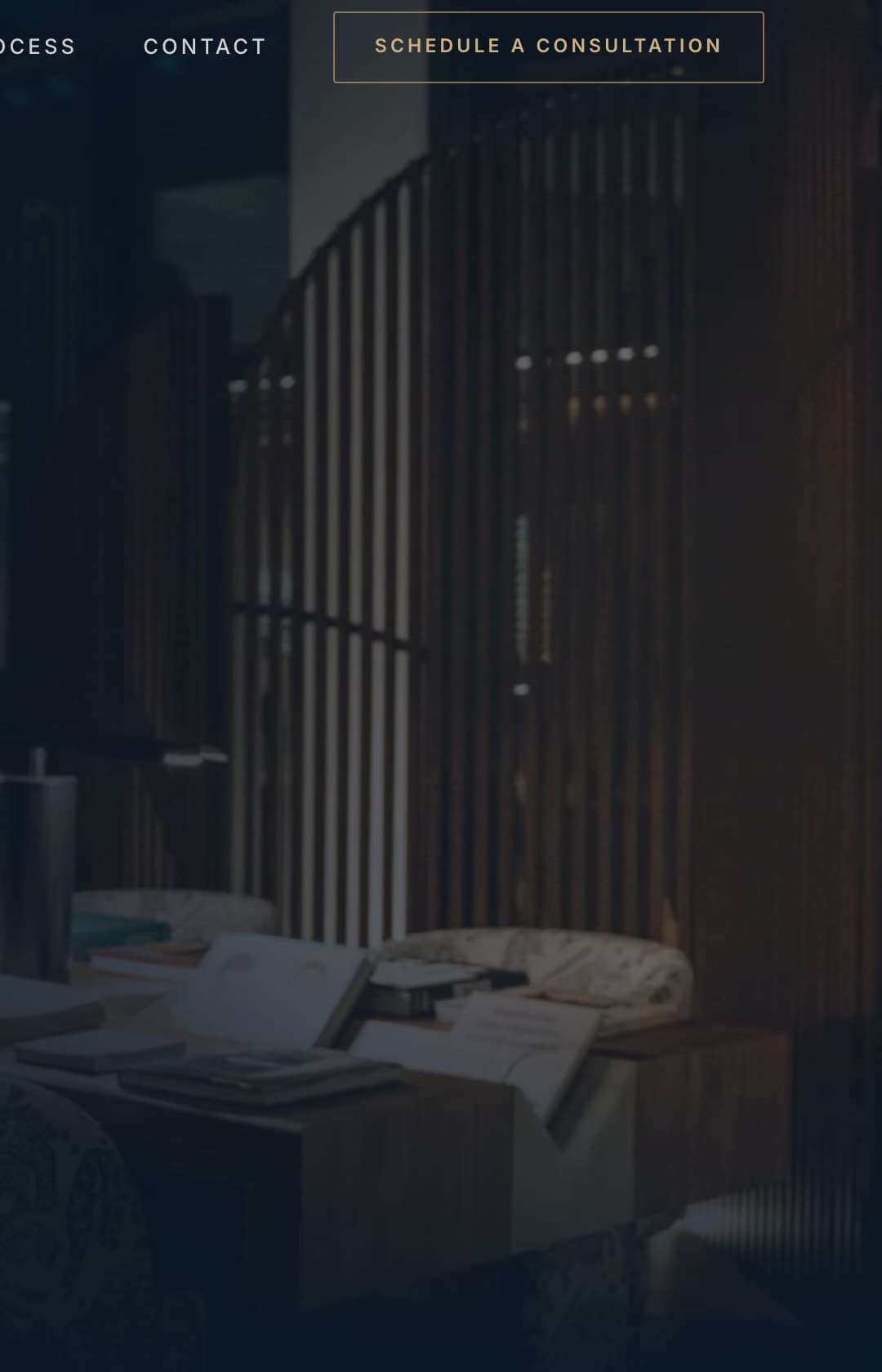
The direction settled on a deep navy and warm gold palette, set in a high-contrast serif with generous space around it. Dark, photographic sections carry the introduction and the closing; lighter paper-toned sections carry the reading (team biographies, services, process) so long passages of text never sit on a dark field.
From the Hudson Associates Wealth website
Design
Design direction
- Palette
- Deep navy, warm gold, bone
- Display type
- High-contrast serif, set large
- Text type
- Geometric sans for reading and interface
- Imagery
- Full-bleed environmental photography, portraits framed in rule
The direction settled on a deep navy and warm gold palette, set in a high-contrast serif with generous space around it. Dark, photographic sections carry the introduction and the closing; lighter paper-toned sections carry the reading (team biographies, services, process) so long passages of text never sit on a dark field.
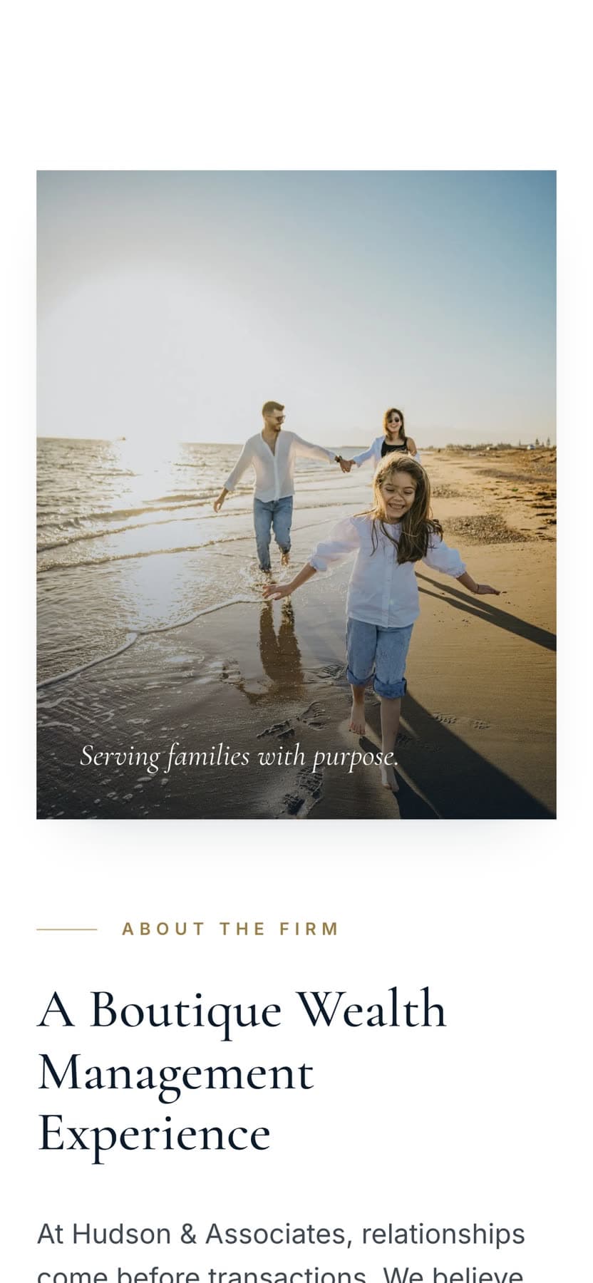
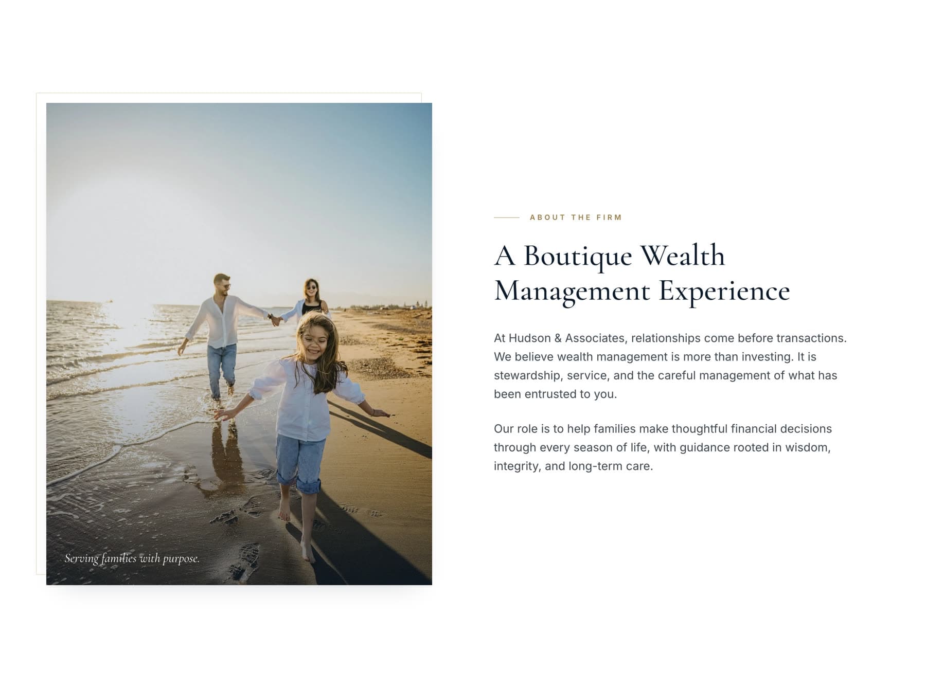
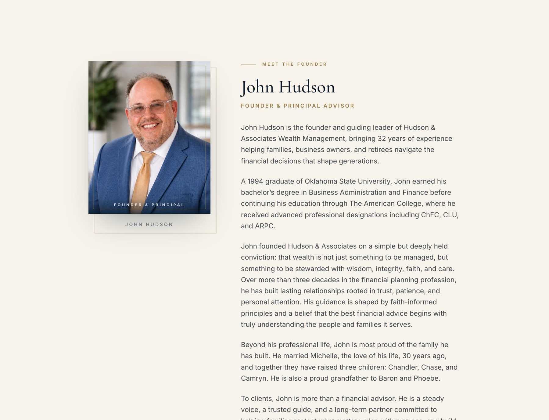
Photography is used at full width and treated as environment rather than decoration. Portraits are framed with a thin gold rule and a printed caption, which gives the team section the feel of a firm profile rather than a staff directory.
The identity mark, a crest carrying the firm's initials, sits at a restrained size in the header and is never repeated as ornament.
Content
Content hierarchy
The page is ordered the way a referral conversation actually goes. A visitor arrives having heard the firm's name, so the sequence answers questions in the order they get asked: who is this, who will I be working with, what do they do, how do they do it, and how do I start.
Team biographies were given real length rather than trimmed to a caption. In a referral business the biography is the product page: a prospective client is deciding on a person, not a service tier.
Disclosures, designations, and recognition footnotes were designed into the page rather than pushed into a legal appendix, so required language sits next to the claim it qualifies.
- 01Positioning: who the firm serves and what it stands for
- 02The firm: history, philosophy, and approach
- 03The team: full biographies for each member
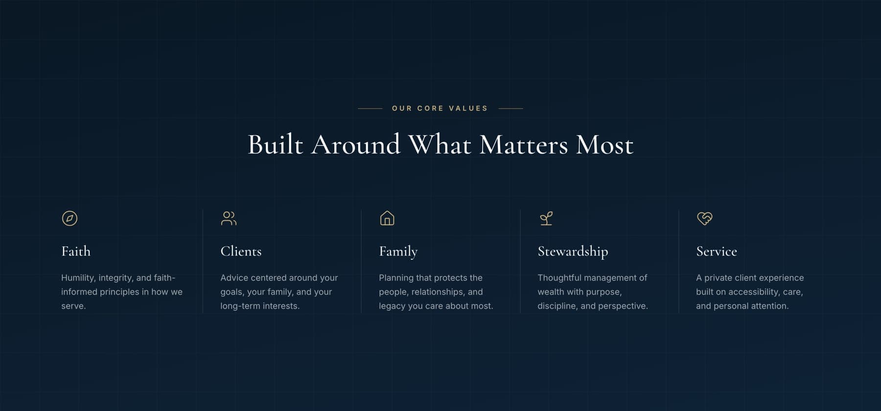
- 04Values: the principles behind the advice
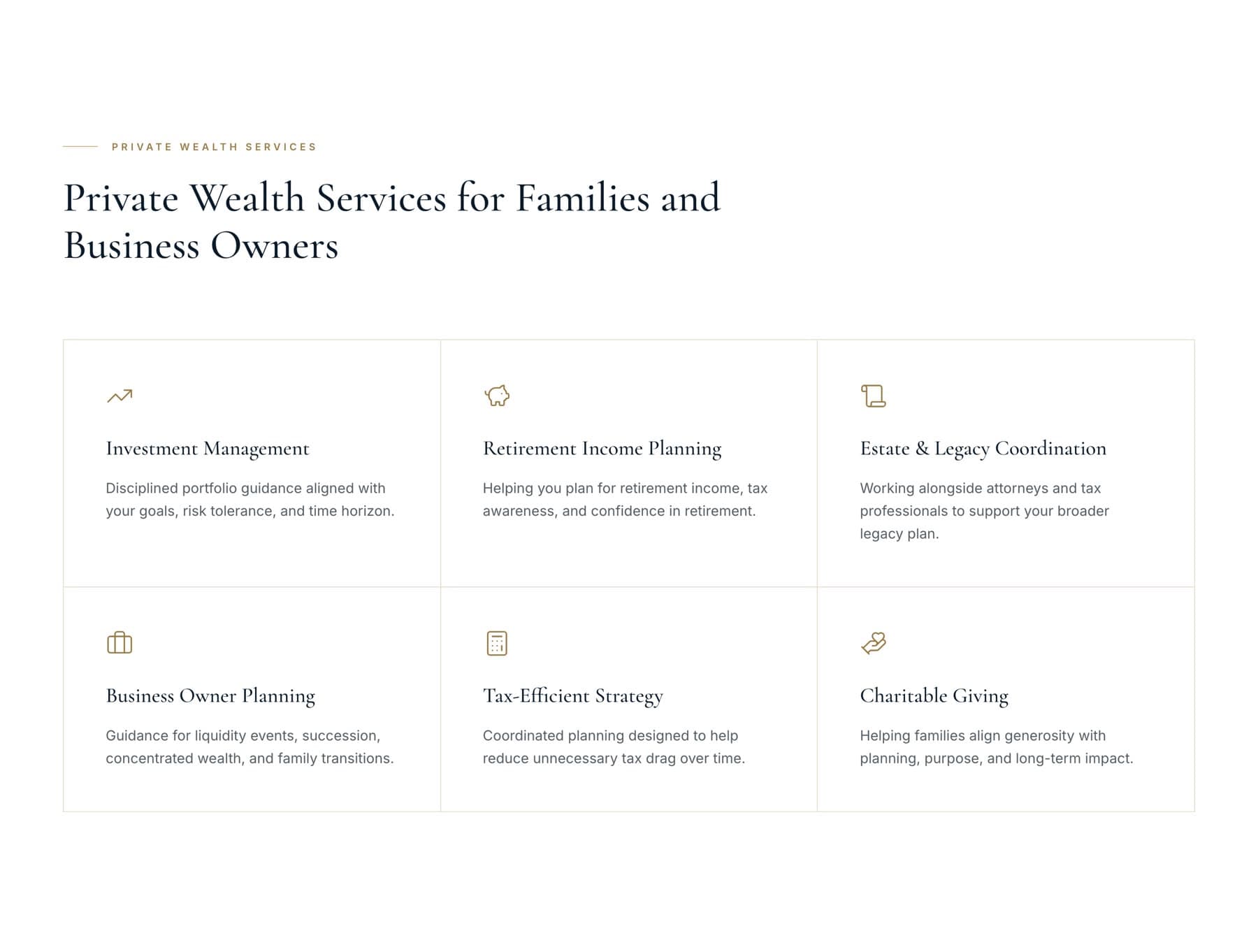
- 05Services: private wealth offerings, plainly described
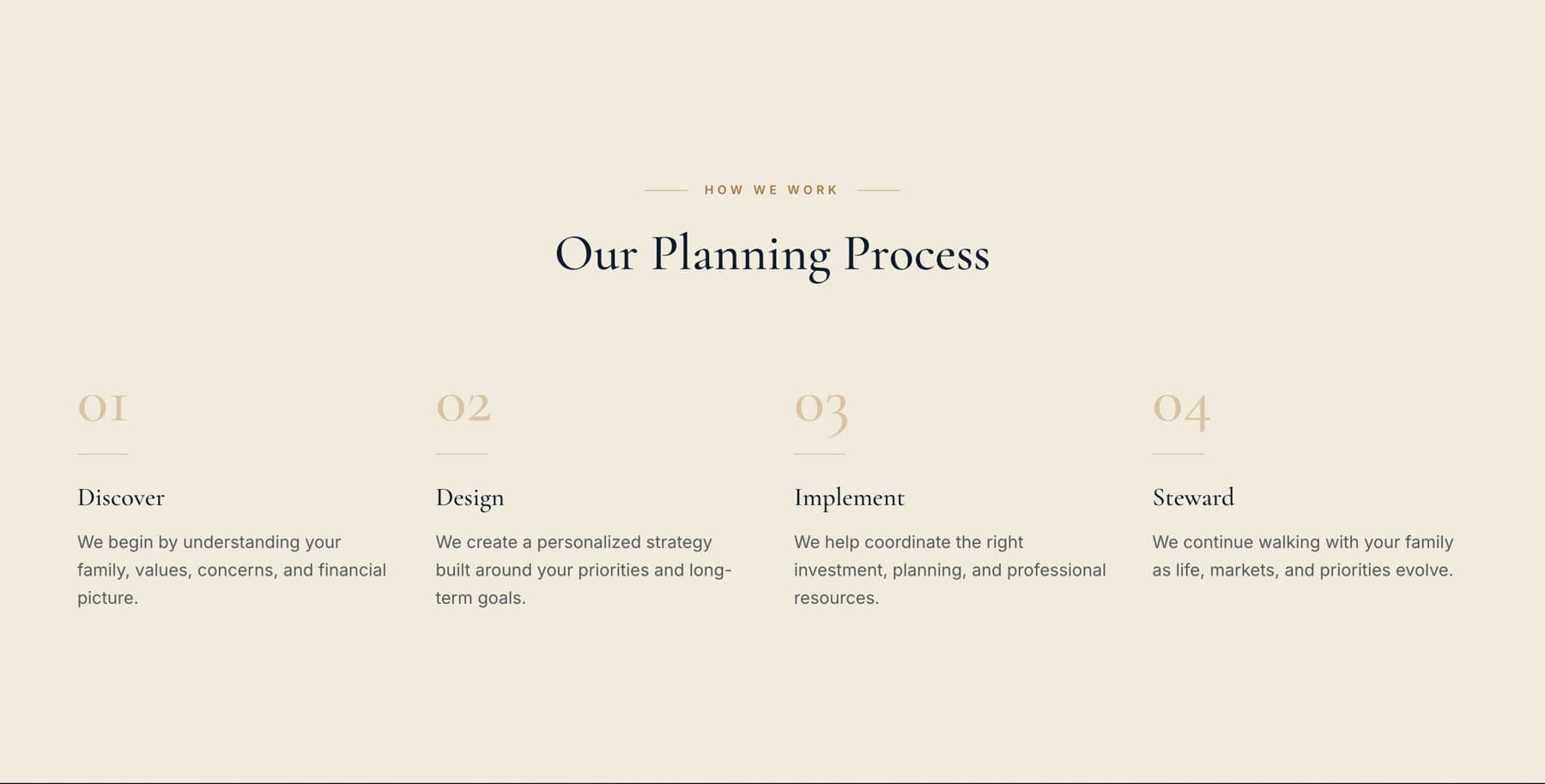
- 06Process: what working together actually looks like
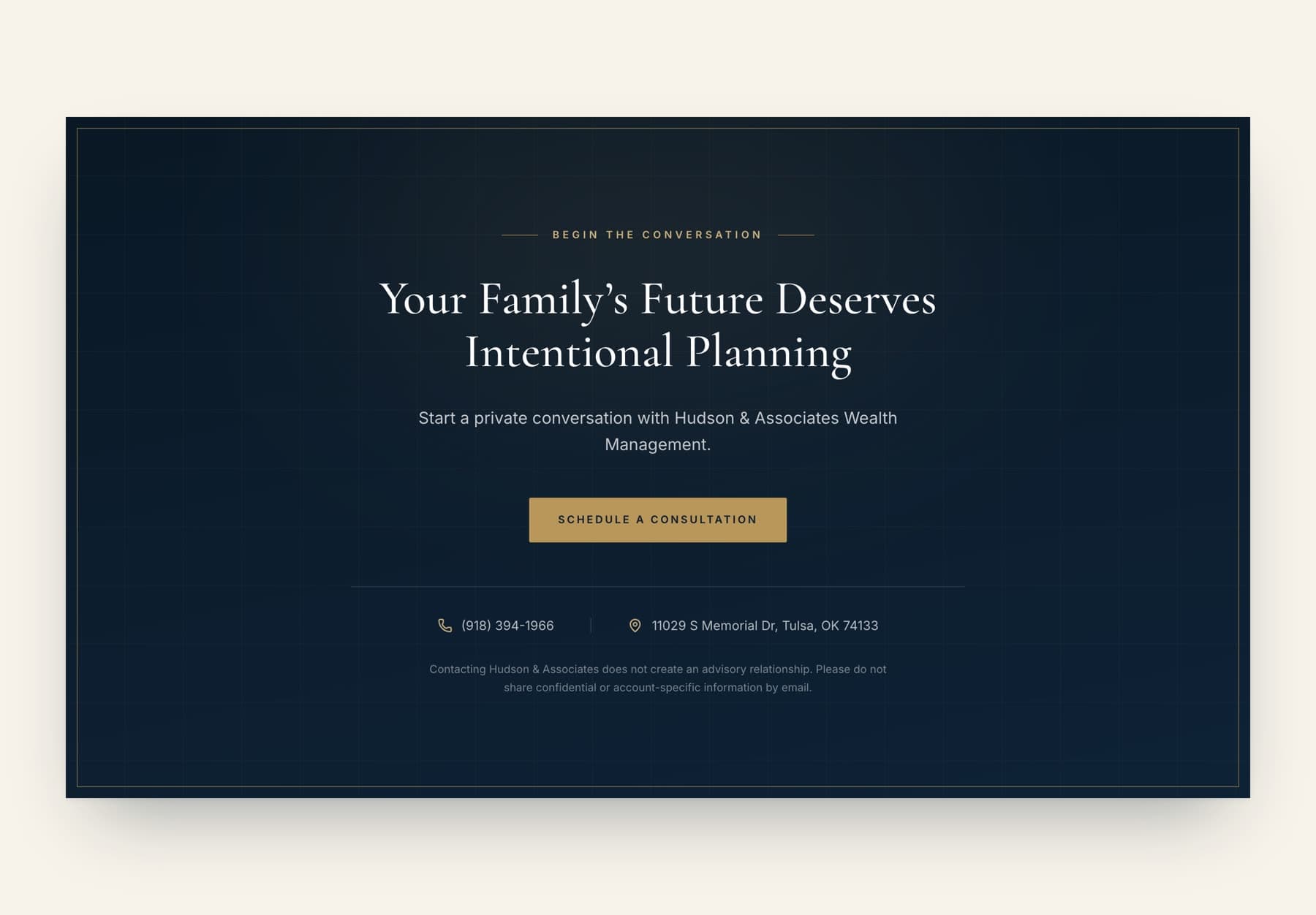
- 07Contact: a single clear path to a first conversation
Mobile
Mobile experience
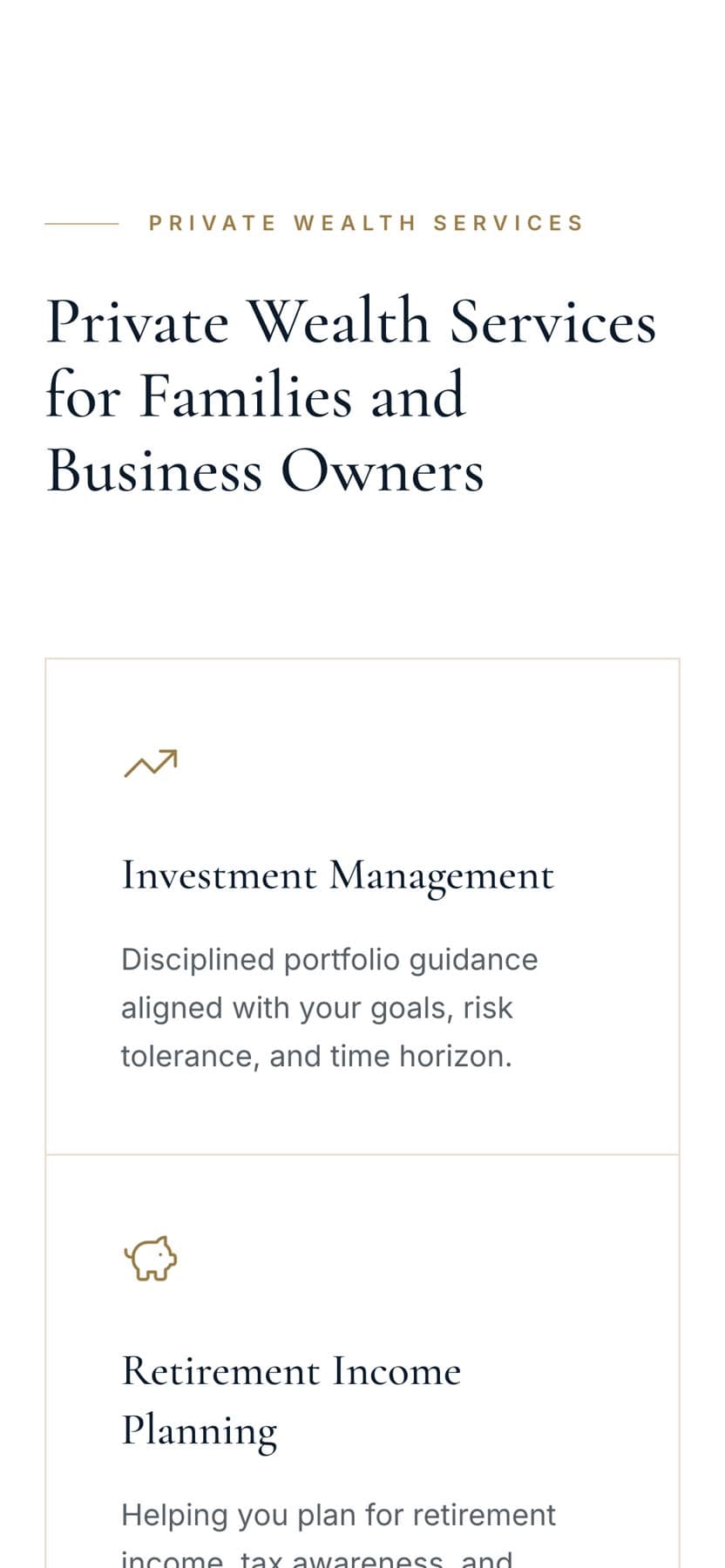
A large share of referral traffic arrives on a phone, often within minutes of the conversation that prompted it. The mobile layout was designed on its own terms rather than reflowed from the desktop grid.
Display type re-sets at a smaller optical size so the headline still breaks across considered lines. The utility bar collapses, navigation moves into a full-height panel, and the long biographies re-flow to a comfortable measure instead of running edge to edge.
Contact details and the consultation link stay reachable throughout, so someone can move from reading to calling without hunting for the way to do it.

Gallery
Selected pages.
See it in use.
Screenshots on this page were captured from the live website. The site itself is the best version of the work.
Want work like this for your business?
Every project starts with a conversation about what the business does and who it is trying to reach.