IAP Wealth
An independent wealth practice whose identity arrived as two logo screenshots on a baked navy field. The mark turned out to contain the firm's own argument, and the site was built outward from it.
- Client
- IAP Wealth
- Industry
- Financial Services
- Location
- Youngsville, Louisiana
- Year
- 2026
- Scope
- Website Strategy
- Custom Web Design
- Development
- Brand Asset Preparation
- Content Organization
- Responsive Design
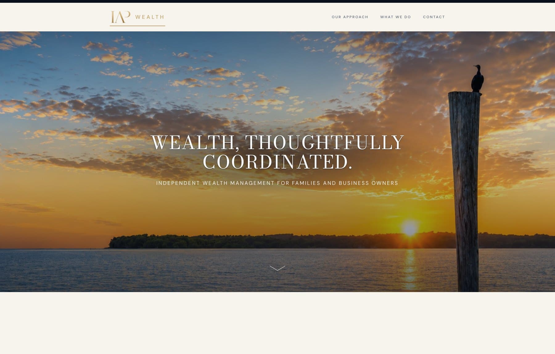

Homepage, desktop and mobile
Overview
What the project needed to do.
IAP Wealth is an independent practice serving families, business owners, and people whose financial lives do not sit in a single account. Its positioning is coordination: working alongside the attorneys, CPAs, and other professionals a client already has, rather than in place of them.
The brief asked for a site that reads as though a person designed it for this firm and no other. For a practice whose whole argument is thoughtful coordination, a layout assembled from parts would have contradicted the pitch before a visitor read a word of it.
The problem
The identity arrived as two PNG screenshots rather than vector masters, both with the navy field baked into the artwork. Before any page could be designed, the mark had to be analysed and usable assets derived from it by keying the artwork off its own background. Nothing was redrawn or recoloured.
Measurement then set the constraints. The word WEALTH in the lockup is pure white, which makes the full mark a dark-surface lockup and illegible on any light ground, so every pale surface on the site needed a different answer rather than a smaller logo. And the tagline turns to mush below roughly 90 pixels of lockup height, which ruled the full lockup out of the header entirely.
Advisory services are offered through an SEC-registered investment adviser, so disclosure architecture had to be designed into the pages from the start. Compliance language that gets bolted on afterwards is the reason so many advisory sites read as though a lawyer edited them last.
Design
Design direction
- Palette
- Ink navy, gold sampled from the mark, bone
- Display type
- High-contrast serif, set large and wide
- Text type
- Light geometric sans at open tracking
- Identity
- Assets derived from supplied artwork, nothing redrawn
- Imagery
- Full-bleed landscape photography, used as atmosphere
Of the two supplied concepts, the modern one became the primary mark: a high-contrast serif monogram with an elongated A apex and an open, detached P bowl, set against WEALTH in a light geometric sans at wide tracking. The alternative, a conventional Didone with a diamond lozenge on the rule, reads as a stock finance mark and was kept as a formal alternate only.
The monogram is a ligature. The I, A and P overlap and share strokes so that three letters resolve into one form: separate pieces, thoughtfully coordinated. The firm had already drawn its own thesis, and the site's job was to extend it rather than invent a device alongside it.
The palette was sampled from the artwork rather than chosen for it, which is why it sits correctly against the mark at every size. The header solves the white-WEALTH constraint by setting the gold monogram beside WEALTH as live text in the site's own sans, so a pale ground becomes a deliberate treatment instead of a compromise.
Photography carries the ideas the type cannot. Wide, quiet landscapes open each page and give an otherwise typographic site somewhere to breathe.
Content
Content hierarchy
The site is built around a single claim: significant wealth rarely sits in one place. That idea is given its own register on the homepage, counting through the forms wealth actually takes, before any service is described.
The services pages follow the same discipline. They say what the practice does and, as pointedly, what it does not: coordination alongside a client's existing professionals rather than replacement of them.
The compliance surface was treated as part of the design rather than an appendix. Important disclosures, business continuity, privacy, terms, accessibility, and a cookie policy each have a real page rather than a line of footer small print, and the BrokerCheck route points to FINRA directly.
- 01The idea: what a coordinated practice actually means
- 02Our approach: how the work begins and what it looks at
- 03What we do: services, plainly described and plainly bounded
- 04The whole picture: the forms wealth takes, counted out
- 05Contact: one path to a first conversation
- 06Disclosure: compliance pages given real estate, not footnotes
Mobile
Mobile experience
The lockup constraint bites hardest on a phone. There is no width at which the full mark with its tagline survives a mobile header, so the compact lockup carries it and the tagline appears only where there is room to read it.
Display type re-sets rather than scales, so headlines still break across considered lines instead of wrapping wherever the viewport happens to end. At 1800 pixels the hero sits at 59px; scaled linearly it would land at 14px on a phone, and it is re-set to 27px instead. Navigation moves into a full-height panel.
Contact details stay reachable throughout. The practice expects to be looked up after a conversation, often on a phone, and the path from reading to calling is kept short.

Gallery
Selected pages.
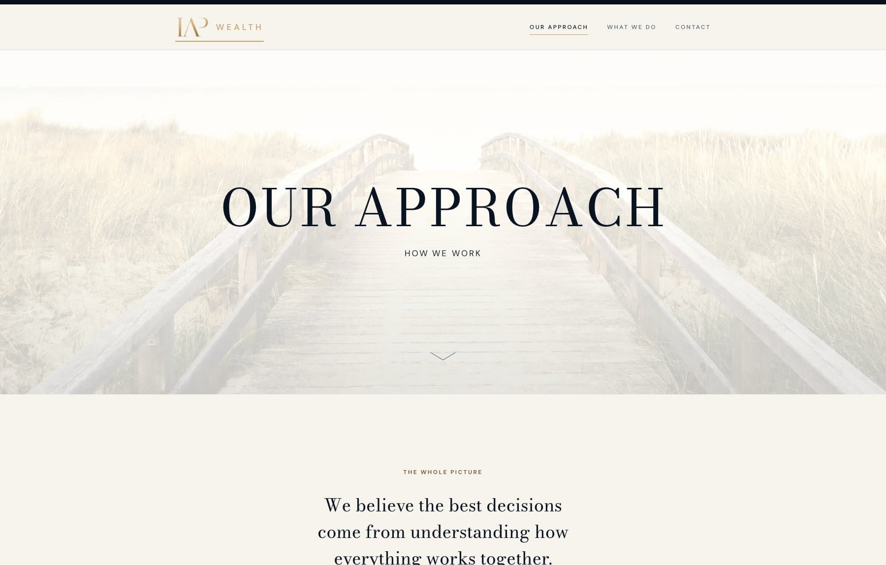
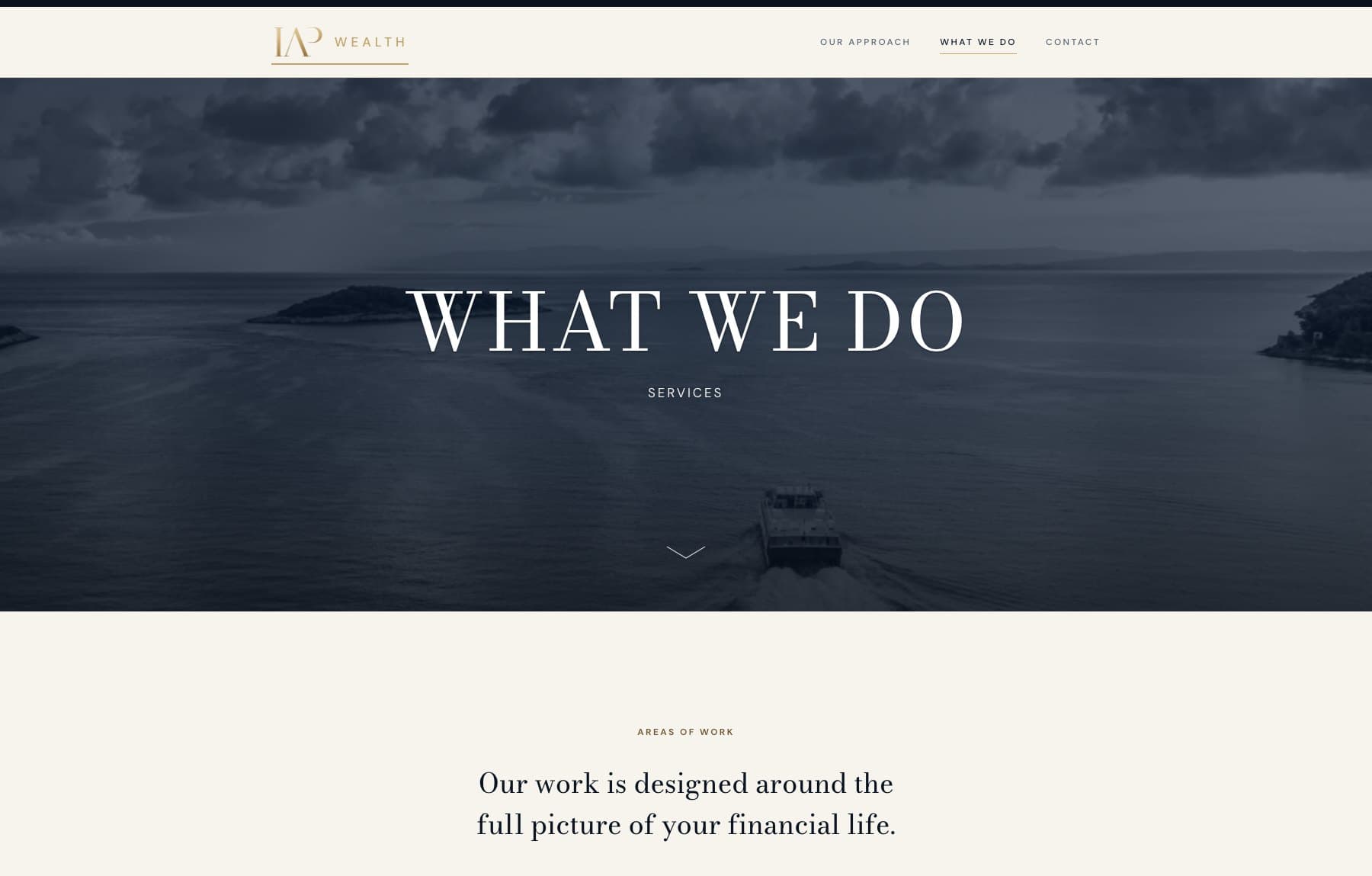
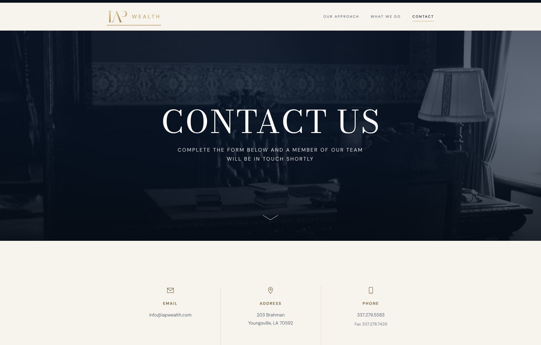
See it in use.
Screenshots on this page were captured from the live website. The site itself is the best version of the work.
Want work like this for your business?
Every project starts with a conversation about what the business does and who it is trying to reach.